LEARN · STYLES
Architectural Rendering Styles: 8 Styles and When to Use Each
Published 6 min read
The same building can be shown in very different ways. An architectural rendering style sets the tone of a presentation: a photorealistic image says "this is what you will get", while a watercolor or clay render says "this is the idea — let's discuss it". Choosing the style deliberately helps the image do its job.
Below are eight common architectural rendering styles, what each one communicates and when to use it.
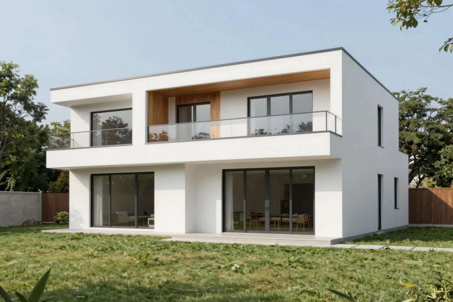
1. Photorealistic rendering
Looks like an architectural photograph: accurate materials, natural light, real context. The standard for marketing, sales and final client approval.
Use it for: Final presentations, property marketing, planning images.
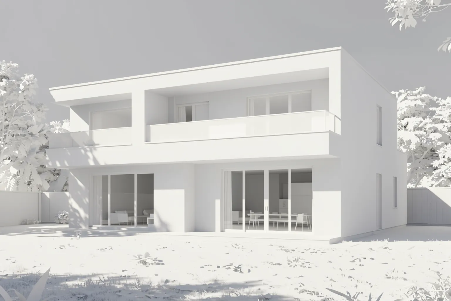
2. Clay (white model) rendering
All surfaces in one matte, neutral material with soft shadows. Removes the distraction of materials so the form, massing and light can be judged on their own.
Use it for: Massing studies, early design reviews, daylight and shadow discussions.
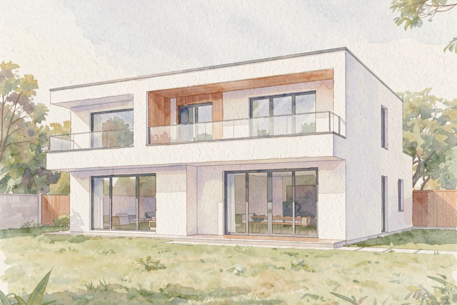
3. Watercolor rendering
Loose, painterly washes of color that feel hand-made. Signals that the design is a proposal, not a finished product.
Use it for: Concept presentations, competition boards, residential and landscape schemes.
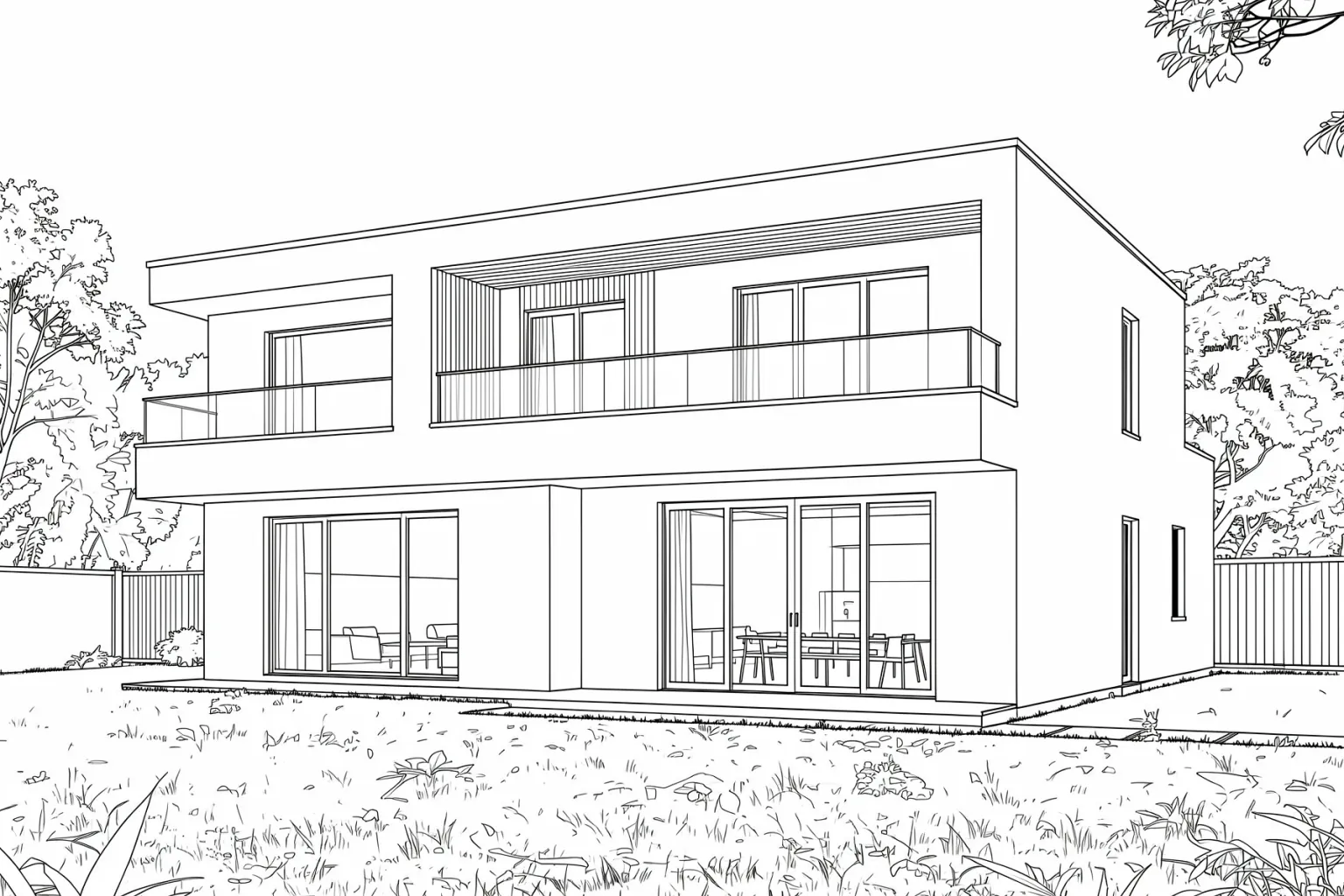
4. Line drawing
Clean black-and-white linework, sometimes with a single accent color. Communicates geometry precisely and reproduces well in print.
Use it for: Diagrams, publications, design narratives, technical-feeling presentations.
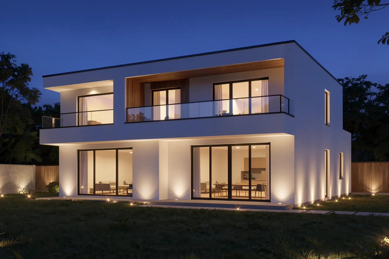
5. Night and dusk rendering
Blue-hour skies and warm interior light make a building feel alive. Often the most emotional image in a set.
Use it for: Hospitality, residential and retail projects; hero images for brochures and websites.
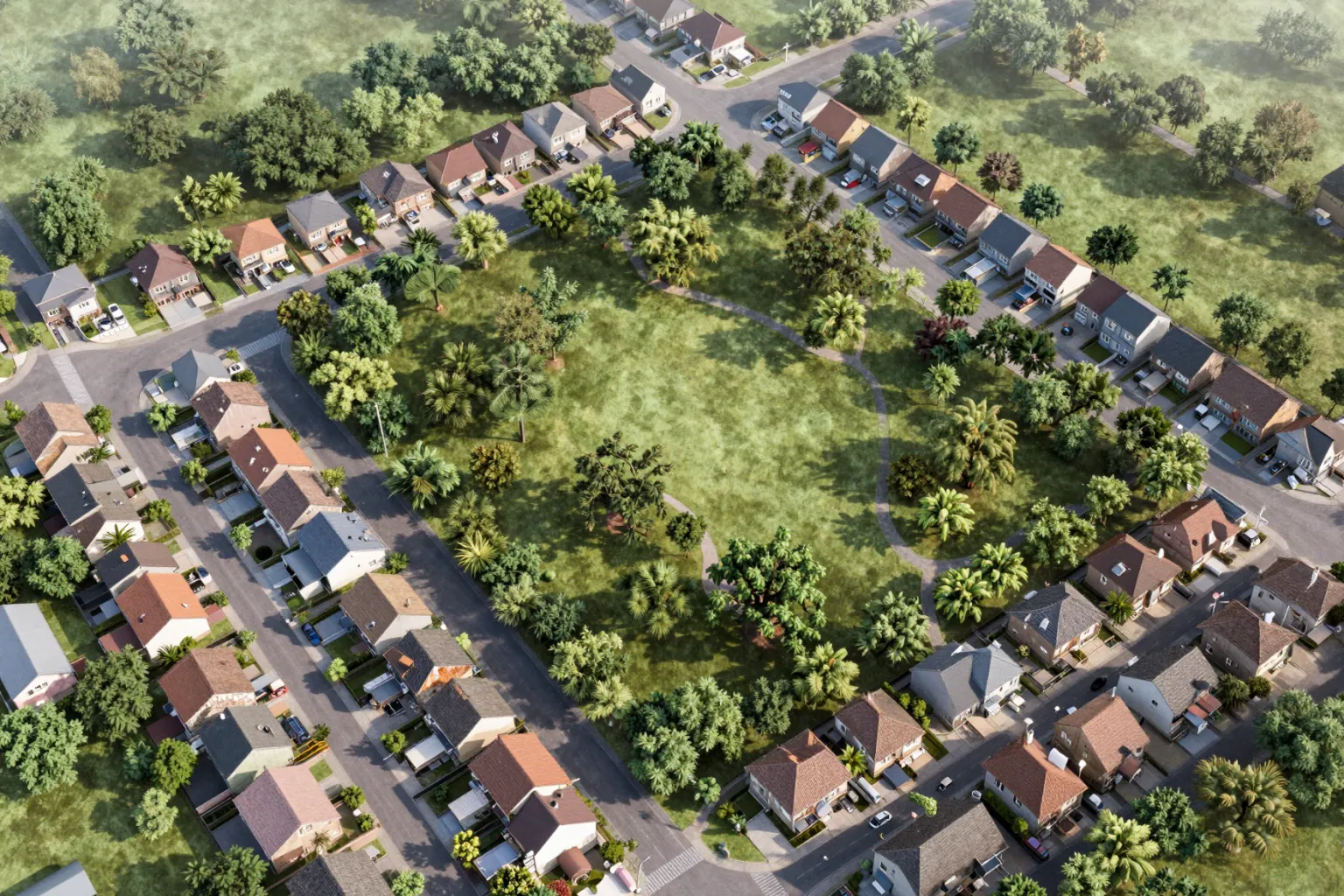
6. Aerial rendering
A bird's-eye view that shows a building in its neighbourhood, or an entire masterplan with streets, green spaces and blocks.
Use it for: Masterplans, urban design, campuses, site context for planning.
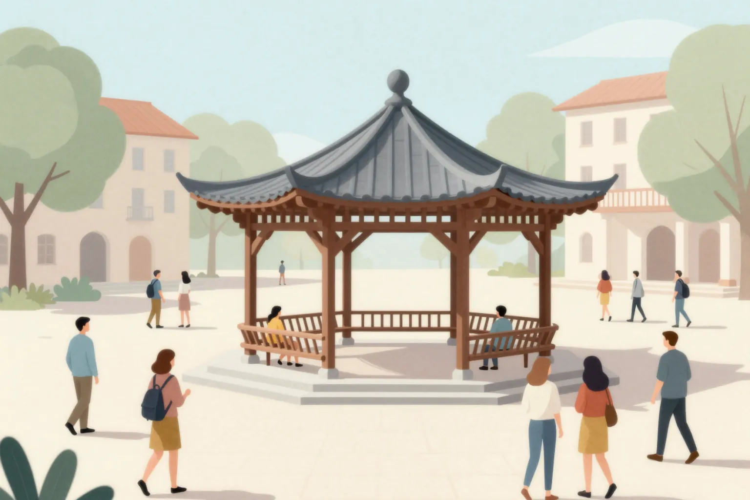
7. Collage rendering
Flat colors, paper textures and cut-out figures in a graphic composition. Popular in competitions and academic work for its strong, editorial look.
Use it for: Competitions, student juries, conceptual and public-space projects.
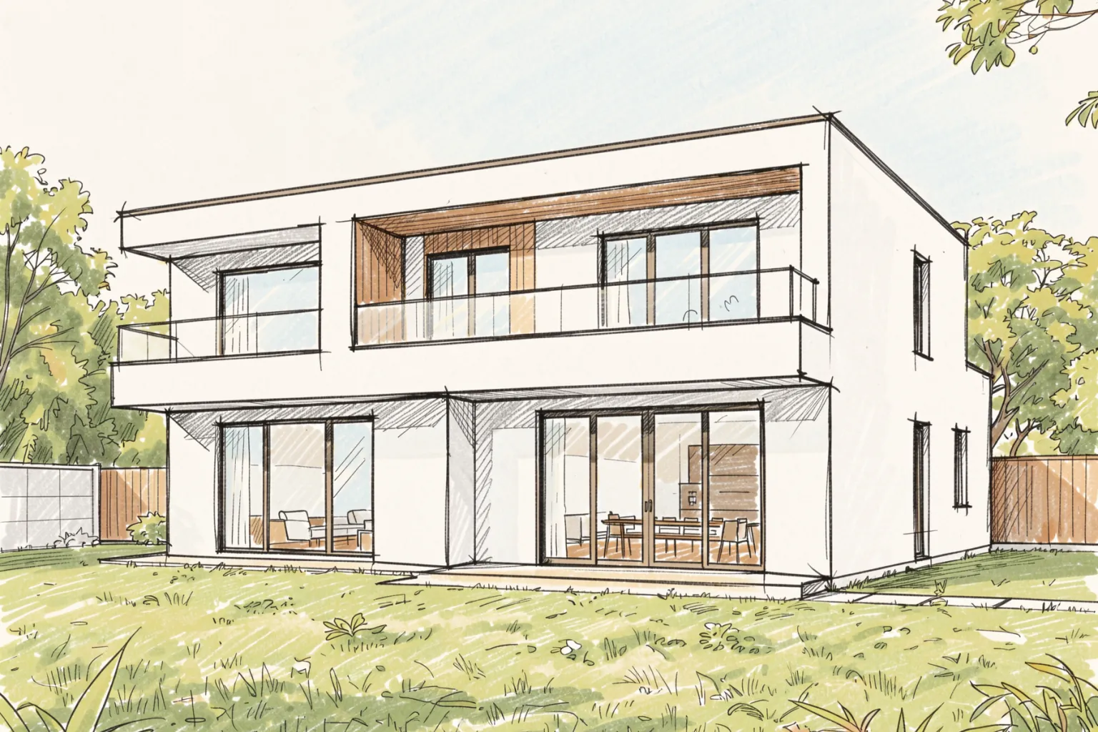
8. Sketch-style rendering
Marker or pencil look with visible strokes. Feels personal and open to change, which makes clients comfortable giving feedback.
Use it for: First client meetings, idea exploration, workshop material.
How to Choose a Rendering Style
- Match the design stage: sketch, clay and watercolor for concepts; photorealistic for approval and marketing.
- Match the audience: juries and academics often prefer collage or line work; buyers expect photorealism.
- Keep a set consistent: use one style across all images of the same presentation.
- Use light for emotion: a night or dusk version of the hero image is often the most persuasive.
Rendering Styles With AI
With AI rendering you do not need a different software pipeline for each style. In QUVIAI you choose a style from the Architecture or Illustrator categories and generate from the same sketch, model view or prompt — or turn an existing render into a night version with one instruction.
Frequently Asked Questions
What is the most common architectural rendering style?
Photorealistic rendering is the most common for marketing and final presentations; clay and sketch styles are common in early design.
What is a clay render?
A clay render shows the whole scene in a single matte, neutral material so that form, massing and shadows can be judged without materials.
Can I create different rendering styles from one model with AI?
Yes. Keep the same input and change only the style setting to get photorealistic, illustrative or sketch versions of the same design.